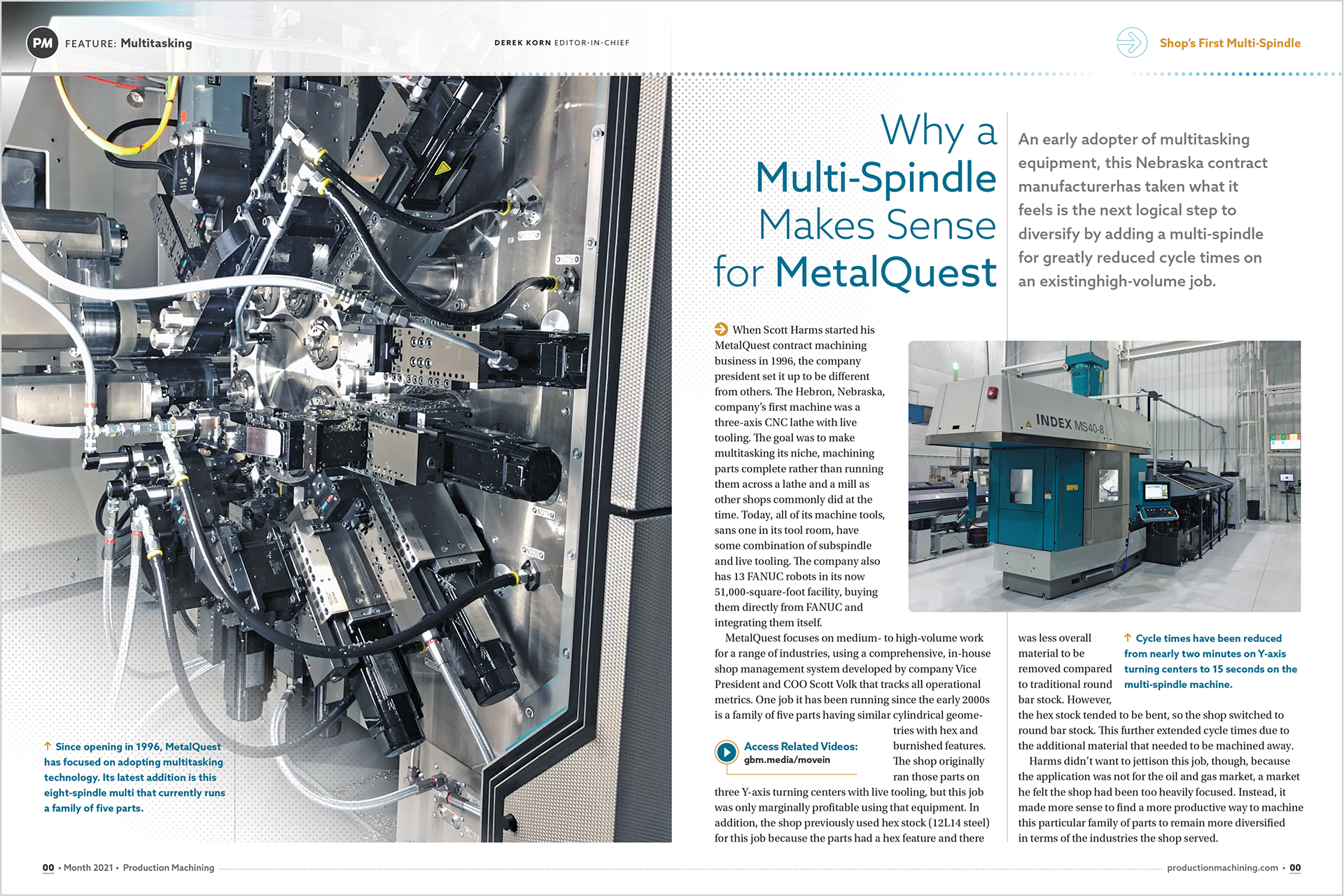
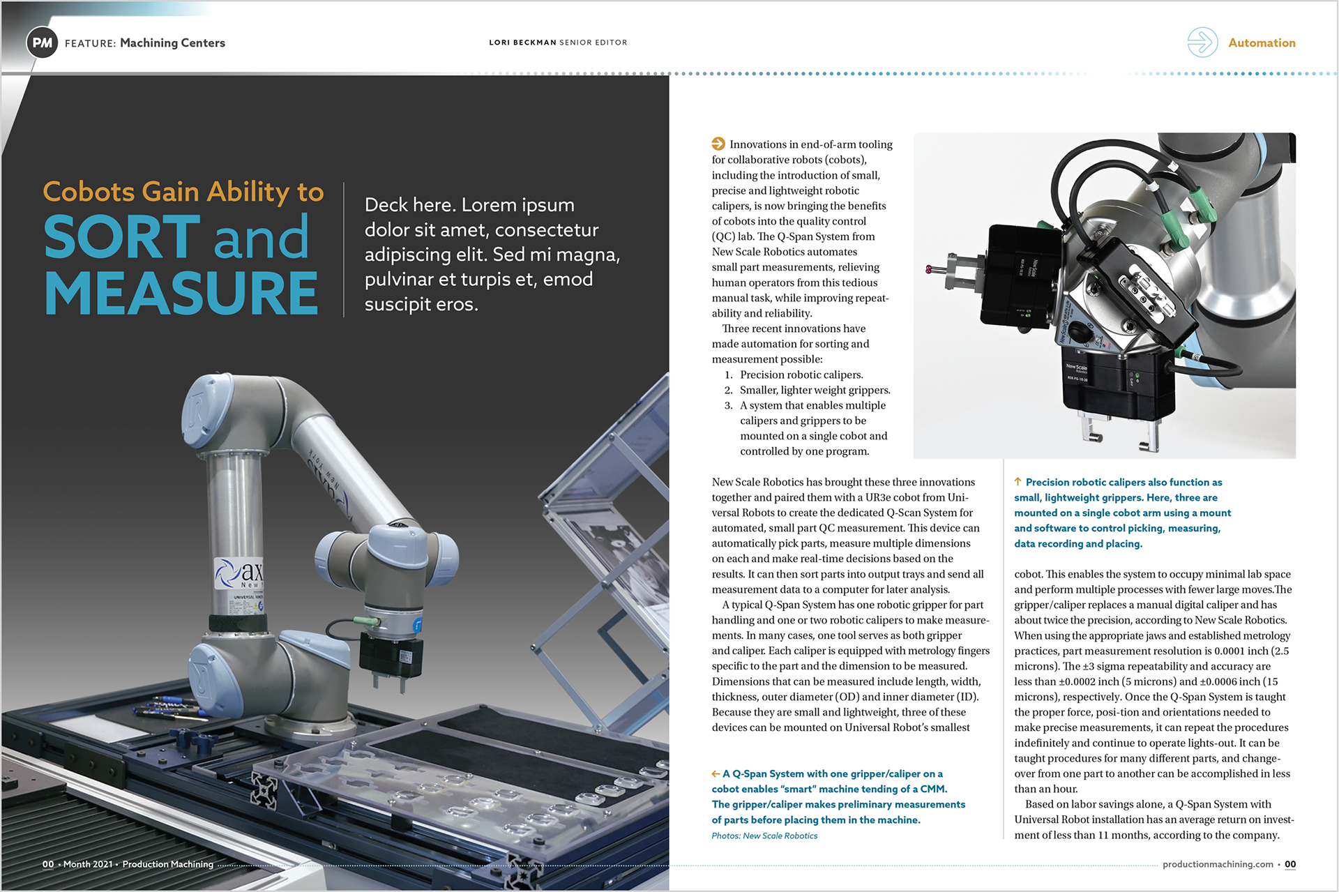
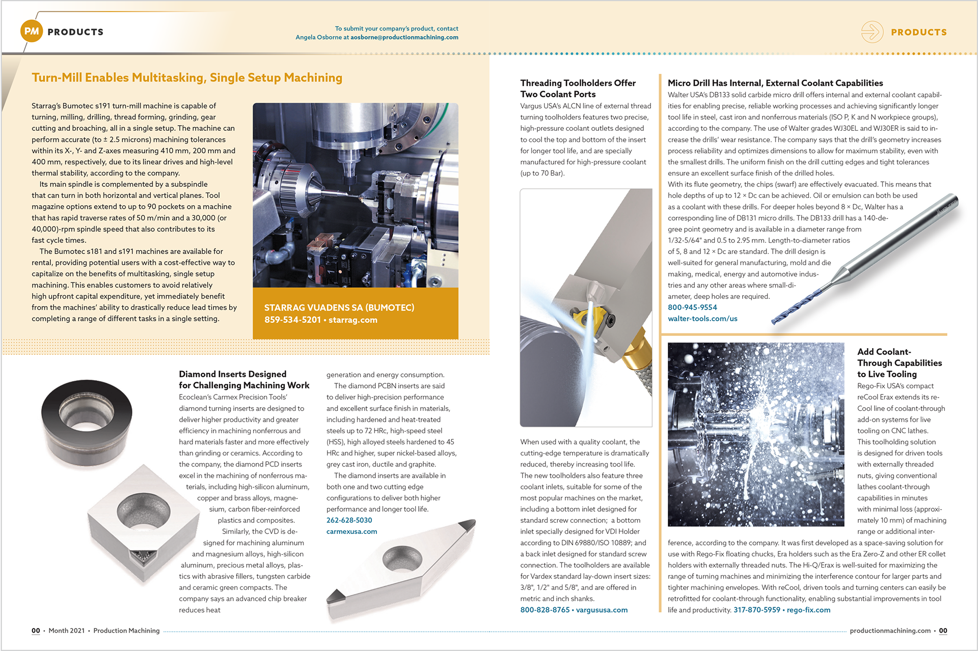
Magazine redesign
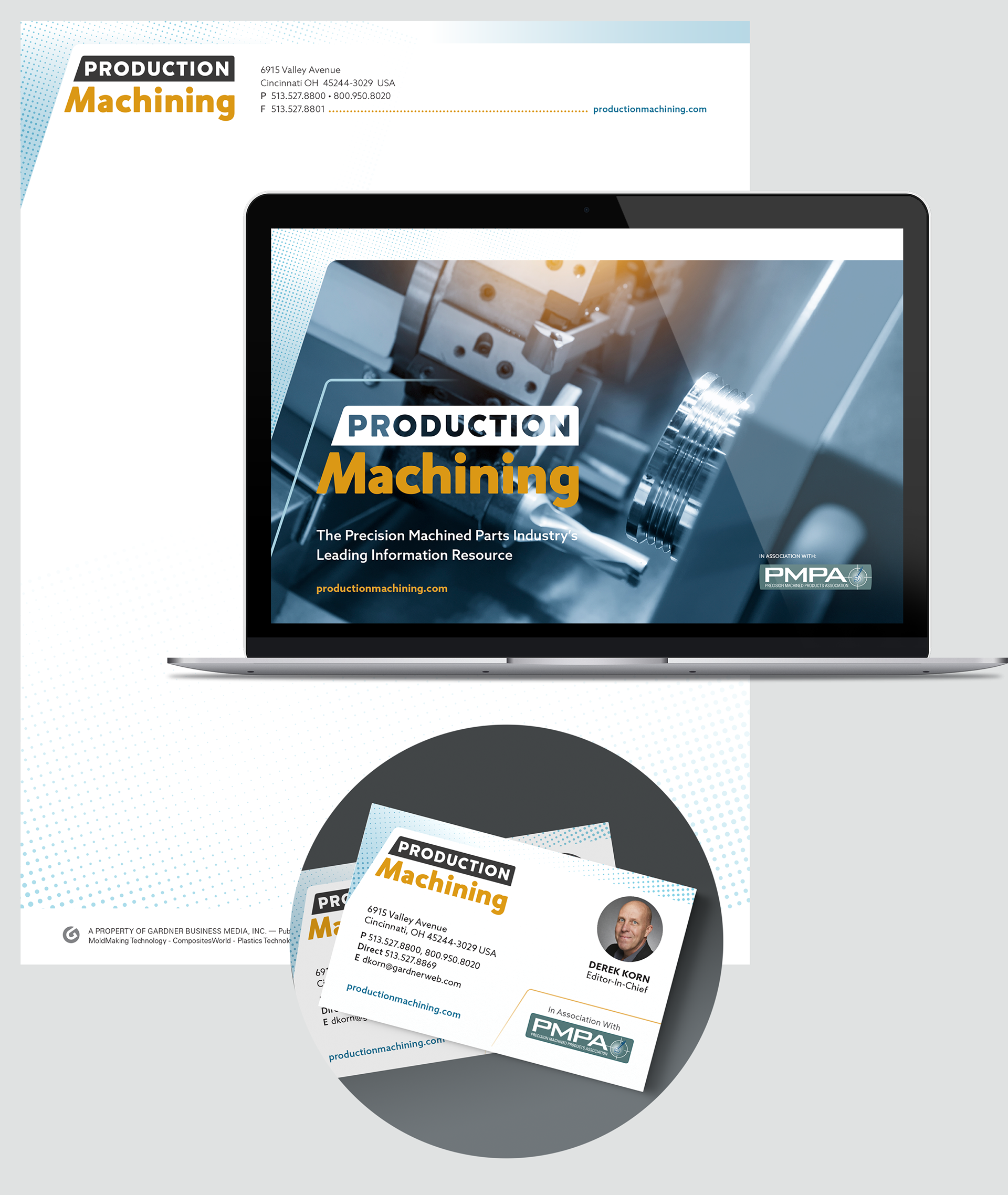
Stationery + PowerPoint template
Social media + e-newsletter graphics
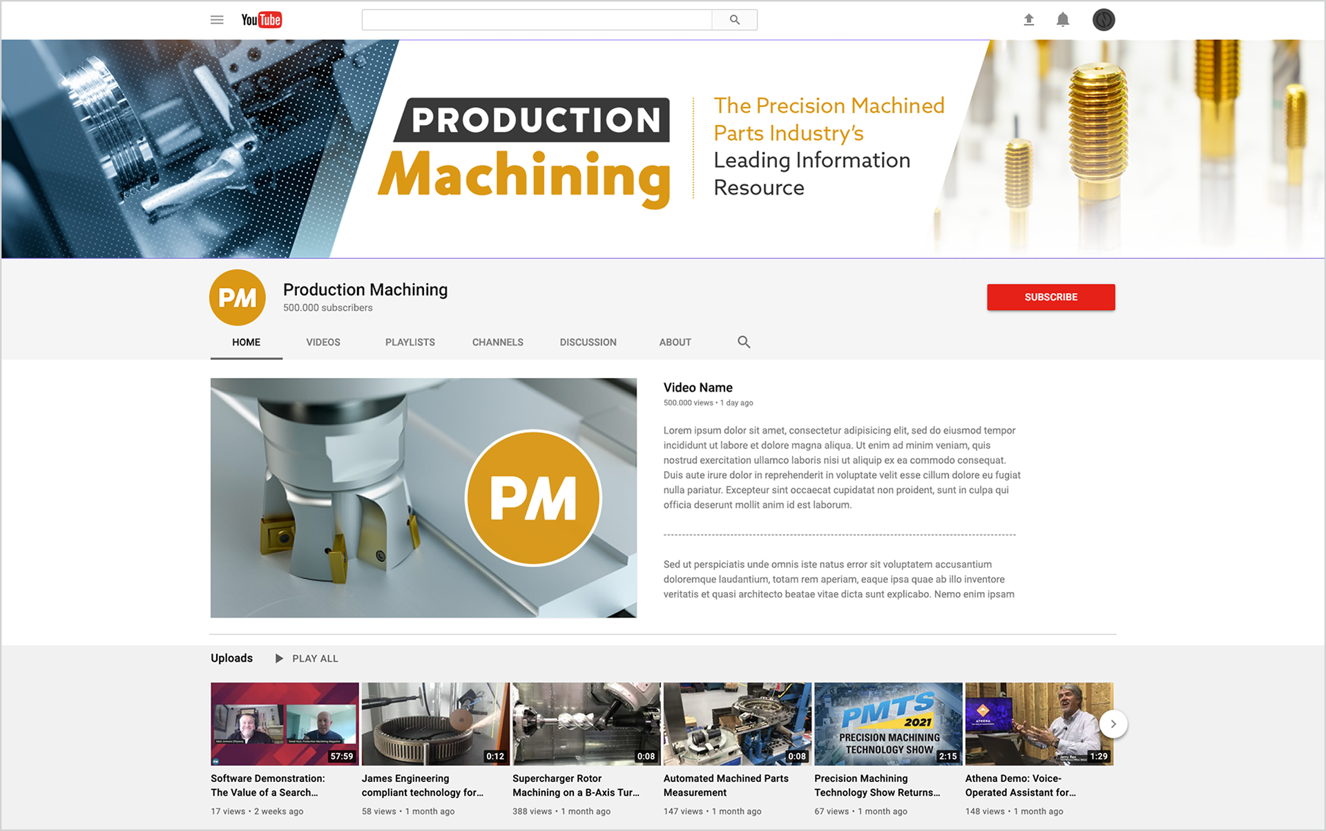
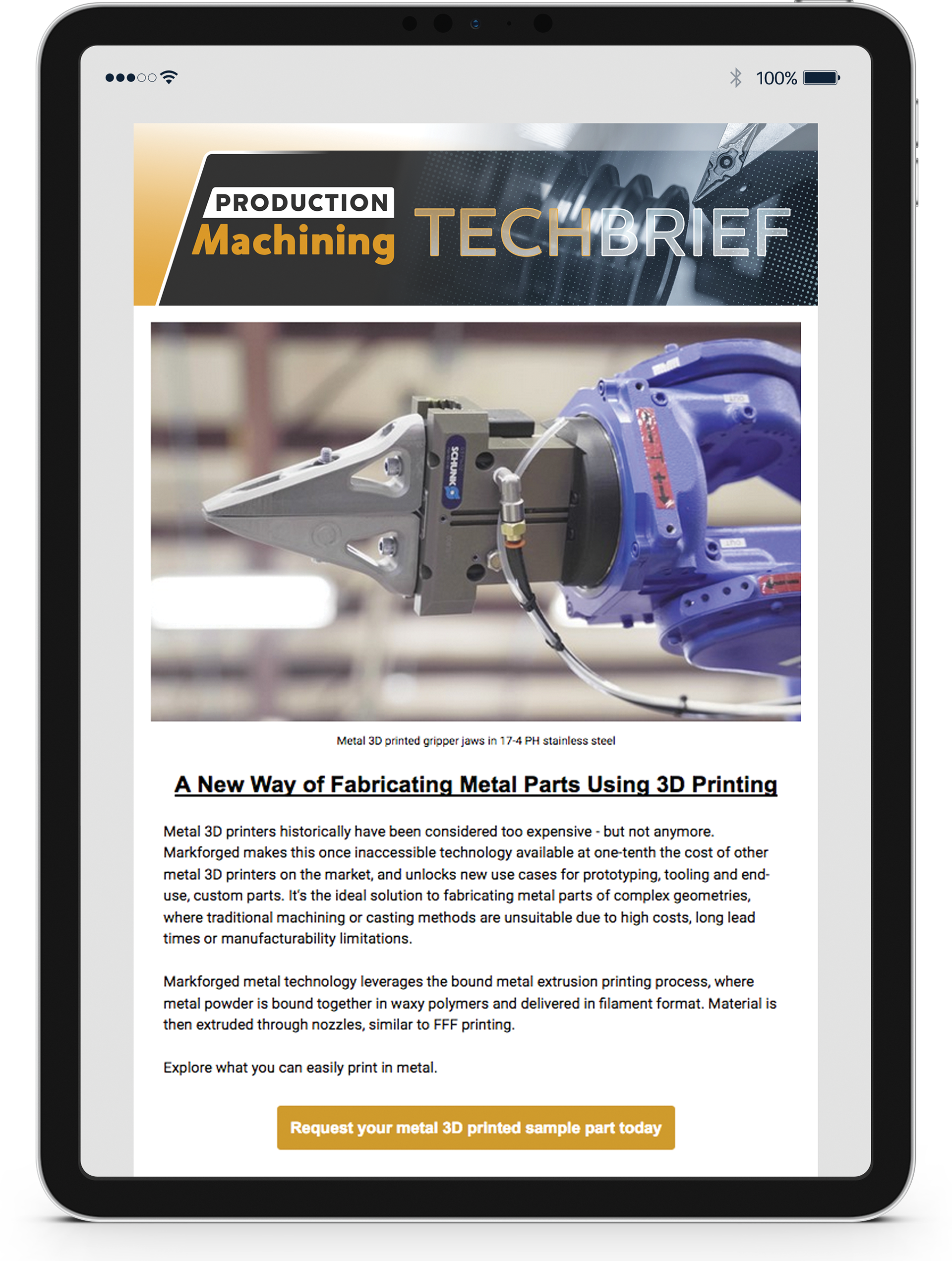

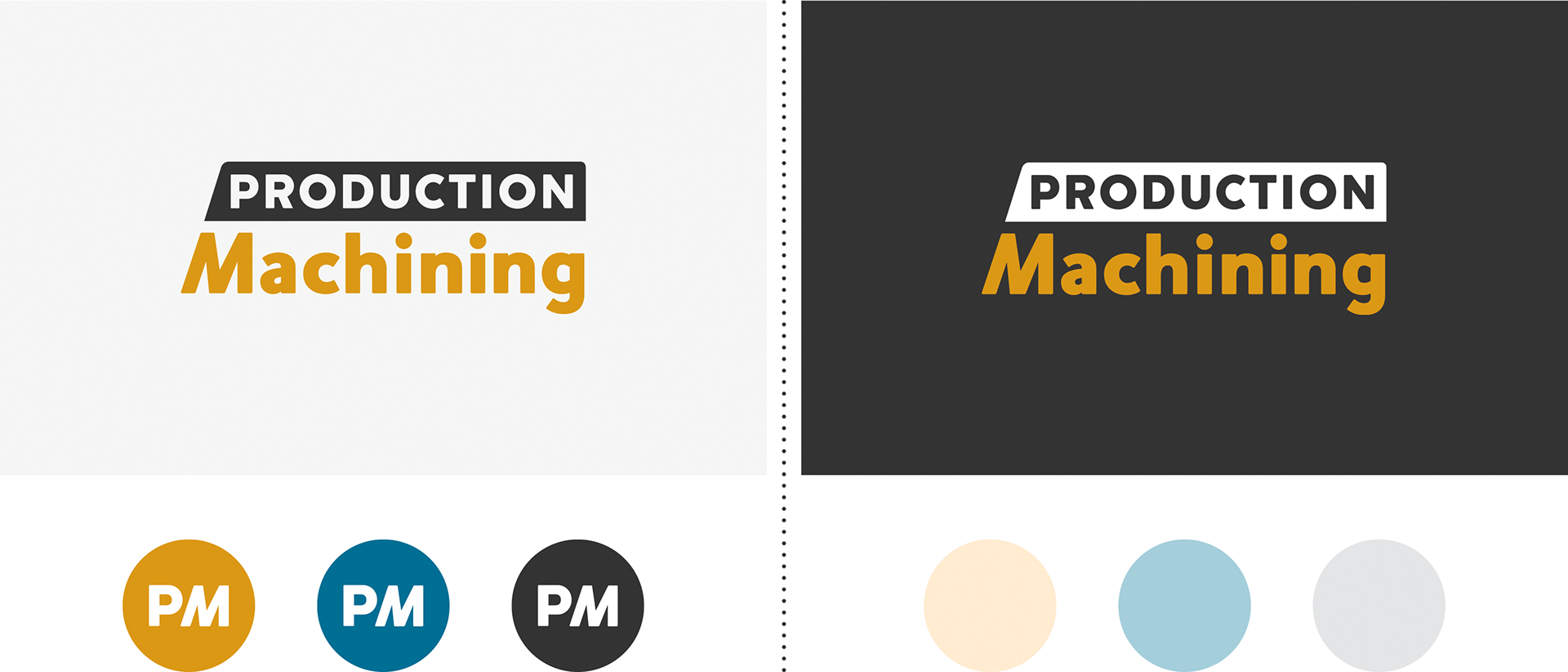
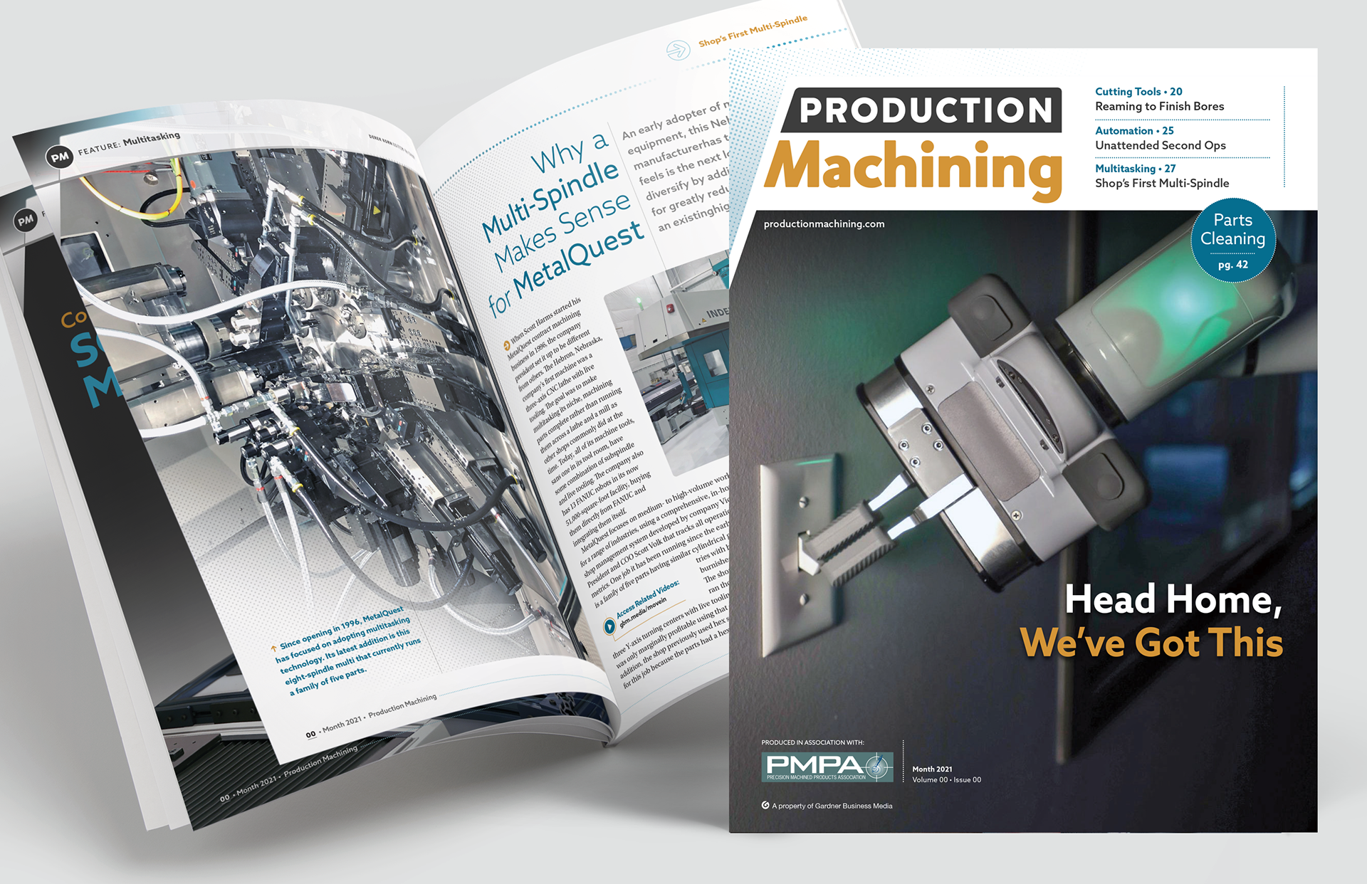
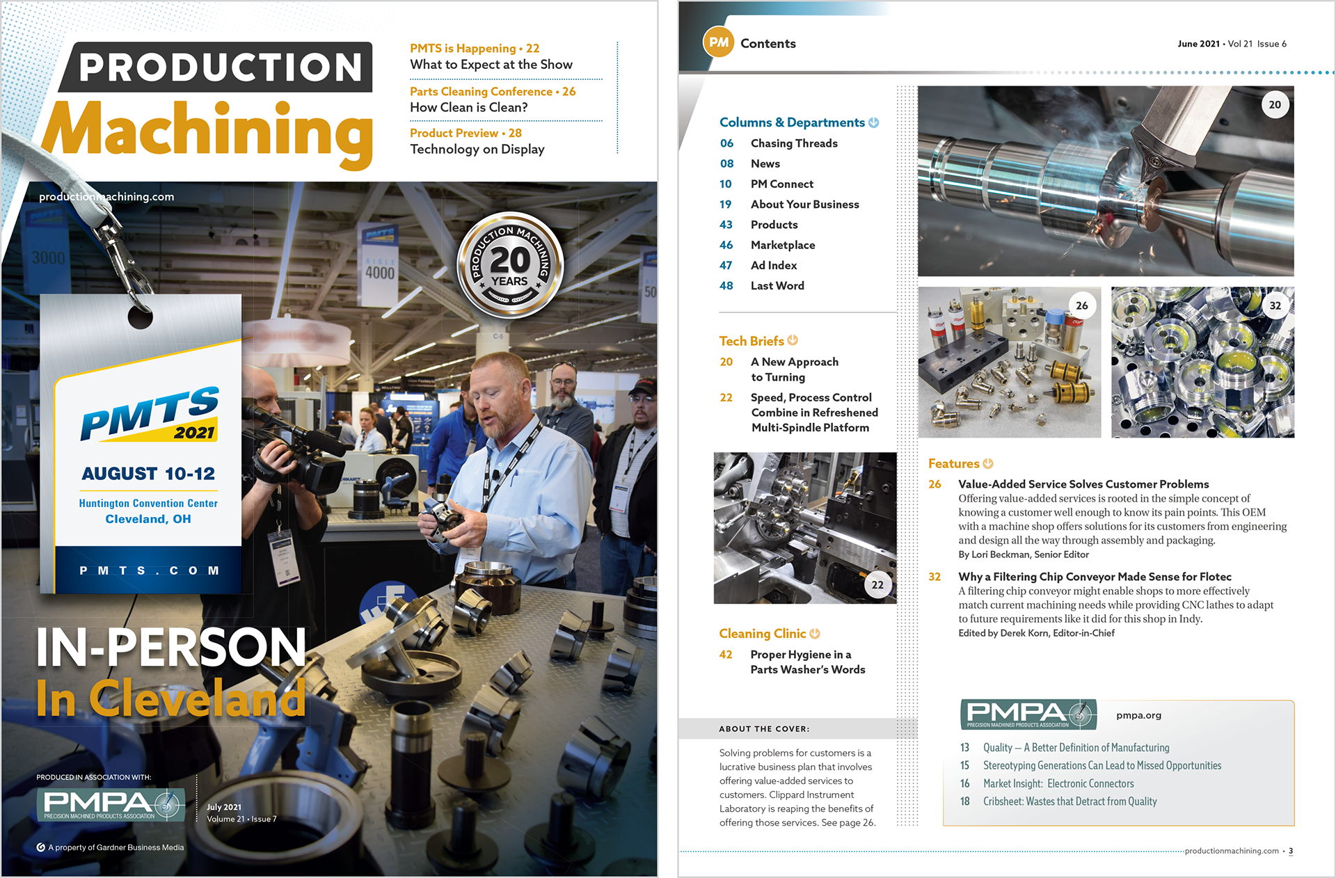
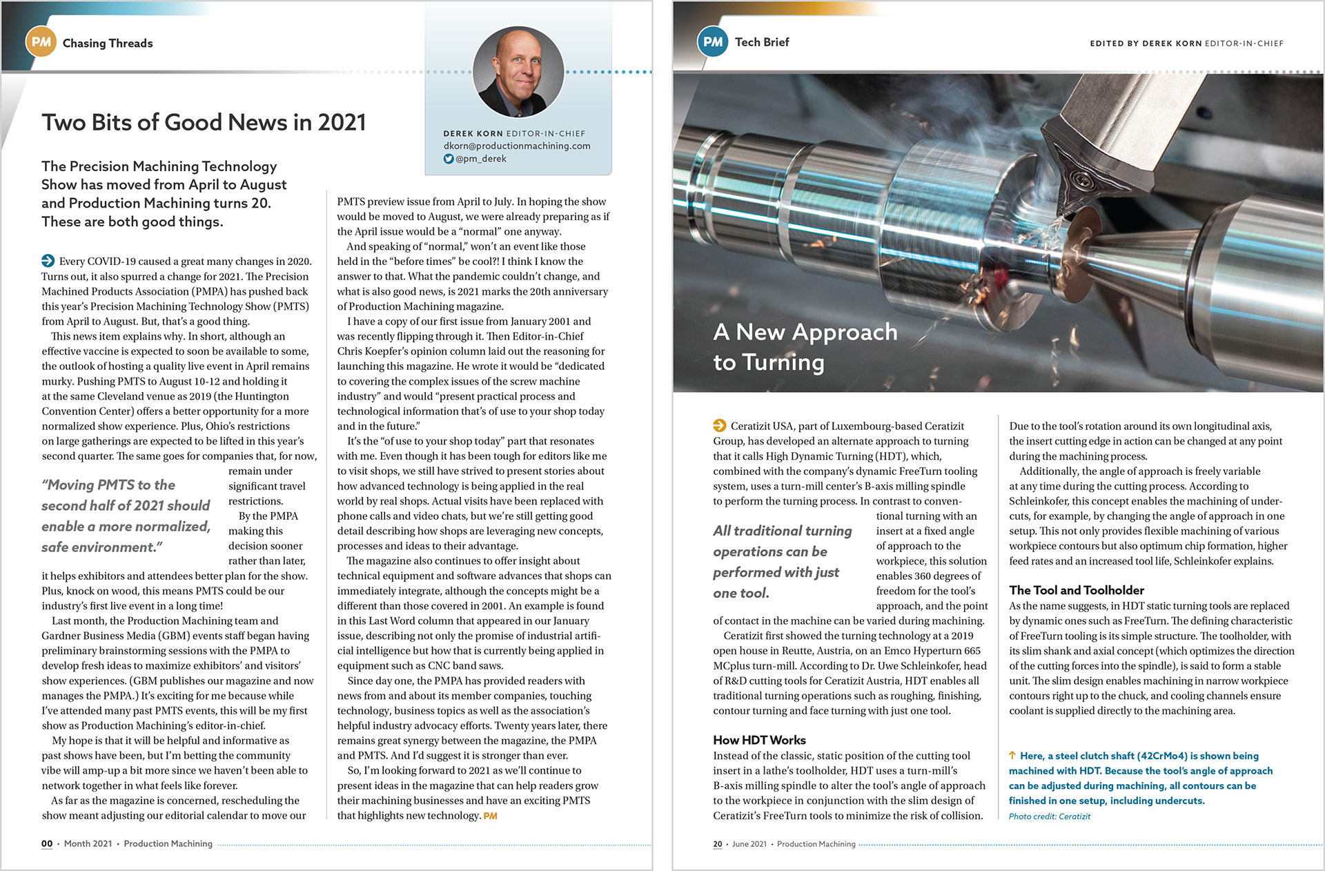
Having worked on Production Machining’s first visual refresh in 2012, I was excited to return as creative lead in 2021 to further evolve the media brand alongside the PM editorial team. The update reflected the publication’s growth and its continued relevance within the precision machining industry, introducing a more contemporary color palette, a refined logo, and a new “PM” mark that could function as a flexible, standalone brand asset. Designed to work independently from the primary logo, the mark provided an additional recognizable expression of the brand that could be used across applications where the full logo wasn’t practical or where a more compact identifier was needed. Drawing inspiration from precision machine turning operations, I also developed a family of dot patterns and circular elements that became a distinctive visual thread throughout the magazine redesign, stationery, social platforms, digital assets, and marketing collateral. Together, these elements gave the brand a more contemporary and cohesive visual language while creating a subtle connection to the precision and technical nature of the industry.