

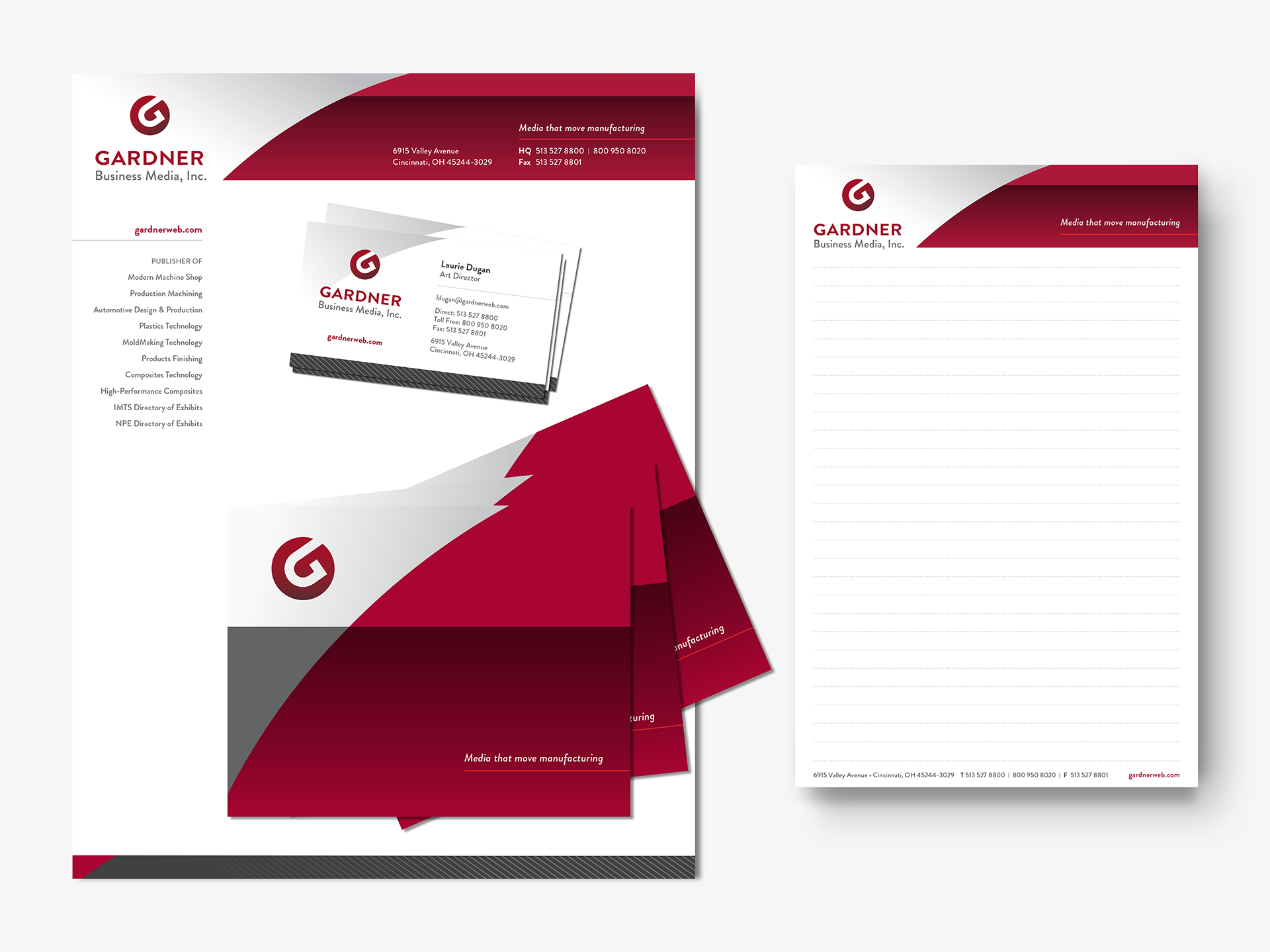
New stationery system
Media usage report


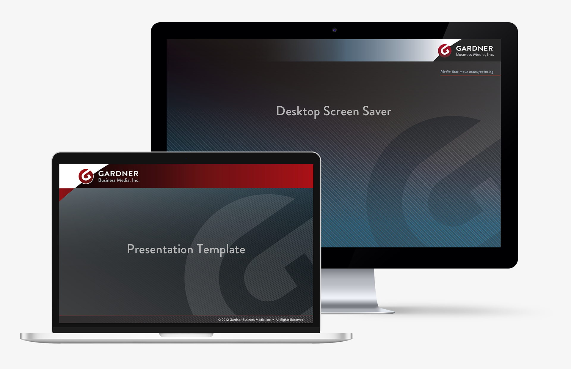
Miscellaneous digital graphics


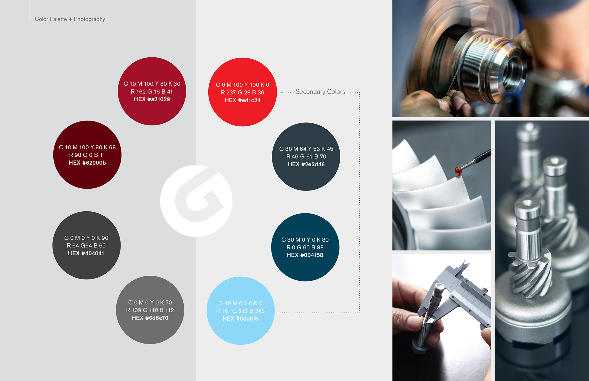
Collaborated with an external consultant and Creative Director to develop a brand refresh strategy that evolved the Gardner Business Media brand. Interviews with key stakeholders provided insight into the company’s aspirations to modernize its image and refine its messaging to increase relevance and connect with a younger demographic, while maintaining core brand equity. Small but strategic moves, including an expanded brand color palette and new design assets, advanced the brand without compromising recognition. The new logo solution is not a complete departure from the former, retaining the “G” as the foundation of the logo mark. The transition from a rigid diamond to a circle was intentional. With the “G” breaking the boundaries of the circle, the mark remains open, symbolizing community, inclusivity, accessibility, and collaboration. The softer aesthetic enhances the brand’s approachability while creating a more contemporary identity designed to stand the test of time. The refreshed identity was extended across the stationery system, corporate communications and reports, social media platforms, website graphics, email communications, signage, swag, and apparel.